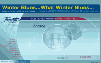
The
amount of moving text on this site, coupled with the animations, would
suggest it is too busy but in fact it is effective rather than confusing
because it has been well thought out by someone who knows how to mix and
match their type. The logo is a graphic design which continuously flies
off. There is a banner headline in red which mixes capitals and lower
case but, contrary to web guides, it works. The designer has even employed
type with capital letters at the beginning of words rather than downstyle
lettering, whereby only the first word or proper nouns are capitalized
for readability.
The use of sans serif and relaxed colouring throught the site lends a sense of harmony. The moving type is confined to the edges of the pages except for the home page which is more activated with a central welcoming panel of blended messages fading in and out. The constant movement suggests energy which is in keeping with the nature of the site.