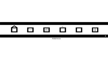
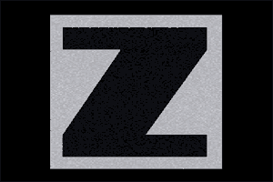
This must be one of the most minimalist sites around, effectively made in black and white. It naturally uses contrast to great effect and all the type is easily seen. There is a large,vibrant letter Z introducing the website which explodes to leave us with a menu constructed of graphic icons which, when rolled over, produce one word links to other pages. The type is sans serif and easily legible.
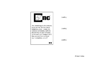
There is little in the way of text even on the explanatory pages. Unfortunately some of the phrases have suffered in the translation from Dutch to English which is a pity on a site of this calibre.The logo is also made of letters in keeping with the rectangular structure of the whole site. The use of white space is most effective and shows how little text is actually required to give sufficient information.