The printed word had also assumed a certain solidity. It was, not only stuck with the same repetitive typographical styles, but it was almost always assumed to be true. Warren Chappell who wrote A Short History of the Printed Word, said, "The strongest feelings I have about printing always return to three simple concepts: the sculptural nature of type, the inevitableness of its arrangement on the page, and the authority of its impression."
Typography developed as a practice, according to Jeff Bellantoni and Matt Woolman in type in motion, "that embodies the design, production and application of interchangeable letter forms in order to convey a message to an audience". The written word conveys two meanings, one related to the idea conveyed by the word, the other to its visual, typographical image. Until early in the last century type had been mainly concerned with conveying meaning through ideas but experiments with typeface design and logos resulted in text moving towards, and becoming part of, the graphical image. These movements have resulted in the myriad of text-based graphics that now permeate the advertisements of modern business practice.
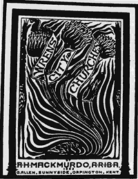
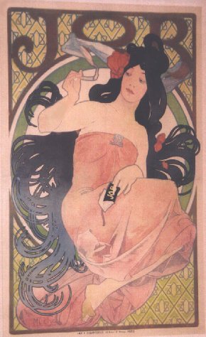
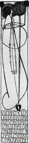
One of the earliest movements was influenced by William Morris who designed three typefaces in the Art Nouveau style. This break with tradition paved the way for the Moderns.