"Text on
the computer screen is hard to read," according to Patrick J. Lynch
and Sarah Horton in their Web Style Guide, "not only because of
the low resolution of computer screens but also because....the lines
of text on most Web pages are much too long for easy reading."
The eye's span of acute focus is only about three inches wide which
is why newspaper and magazines are printed in columns to make them comfortable
and to maximise readability.
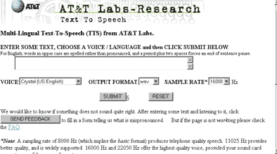
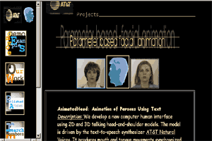
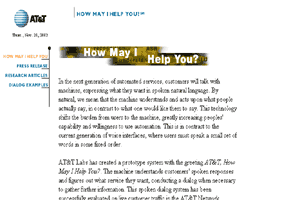
The research taking place at AT & T is fascinating. The moving text in this case is whatever you type for submission to voice simulators for reproduction. You can also watch talking video heads. However, the website is a real mixture of styles, as shown by the three screens printed here, all with different type and text arrangements.The worst, from a typological point of view, is the 'text to speech' form which has the appearance of an early web page created by scientists. These people were more interested in seperating text from graphics and making sure the web would appear on every browser. They did not consider aesthetics or the psychological effect on their viewers. The text is too wide for comfortable reading, there are too many emphasis points, capitals, headings and bold type and so many different font sizes it becomes confusing. The other pages are more structured in their individual styles but all together they form a disjointed web site, possibly created by a variety of people.


