| |
Opening
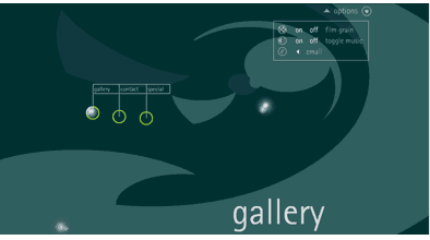
Turtleshell.com is like entering a fairy land of good design. The screens
give an impression of spaciousness and the text, despite being relatively
small, is sans serif which not only says 'modern' but is easy to read. There
is also a larger menu text which moves into view on rollover of the buttons.
The moving and pulsating text is in keeping with the graphic movement within
the screen and gives a sense of wholeness. The menu text is kept to a minimum
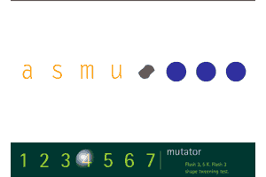
but has user friendly 'go back' and 'sound off' buttons. In the gallery,
Shockwave number 4 is a Flash sequence of circles spiralling into letters
which is visually pleasing and a good marketing feature. Number 5 also has
moving text, too rapid for me to catch in real time, though this is part
of the fun of the game. Whilst toning colours are used for the typeface,
there is good contrast making for high legibility
|
|